How to Make Coloring Pages with AI: The Complete Guide
A deep, practical guide to making professional coloring pages with AI: why most AI output fails as coloring pages, the four controls that determine quality, a real iteration workflow, a quality checklist, and printing guidance.
Most people who try to make coloring pages with AI get a result that looks like a coloring page at first glance — and then falls apart the moment someone tries to color it. Shading bleeds into the "white" areas. Lines break open so color leaks out. The detail is so fine a marker can't stay inside it. This guide is about closing that gap: producing AI coloring pages that are genuinely good enough to print, sell, and hand to a real person.
We build a coloring page generator, so this is the workflow we use and refine every day. It is not theory. Every recommendation here exists because the alternative produced a worse page.
Why Most AI Coloring Pages Fail
Image models are trained to make pictures look good, and "looking good" usually means depth, shading, and texture. A coloring page needs the opposite: flat, two-tone, enclosed line work. When you ask a model for "a unicorn coloring page" with no further instruction, it splits the difference — you get a picture with some outlines but also gradients, gray shading, and decorative texture that ruins it for coloring.
There are three specific failure modes to understand, because each has a different fix:
- •Grayscale intrusion: the model adds soft shading to make the image look dimensional. Fix: explicitly require "pure black outlines on pure white paper, no shading, no grayscale, no gradients." You must forbid it, because shading is the model's default instinct.
- •Open lines: outlines that break or fade, so color "leaks" out of a region. Fix: require "fully closed regions, no open endpoints, no broken lines." This is the single most overlooked requirement.
- •Wrong detail density: too much detail for the audience. A page that is beautiful for an adult is unusable for a four-year-old. Fix: set the audience explicitly — detail level is a choice, not an accident.
Tip: The phrase "coloring page" alone is not enough. It tells the model the genre, not the rules. The rules — two-tone, closed lines, appropriate detail — must be stated explicitly every time.
The Four Controls That Determine Quality
Every coloring page is shaped by four independent settings. Understanding each one — and keeping them independent — is the core skill. The most common mistake is letting them blur together (for example, choosing "bold lines" and accidentally getting "toddler detail" with it).
1. Line weight (how thick the outlines are)
Line weight controls how forgiving the page is. Thick lines are easy to stay inside and read clearly from a distance — ideal for young kids and bold marker work. Thin lines hold fine detail and feel elegant — ideal for adults using fine-tip pens. Medium is the safe default.
- •Thin: fine, precise lines. Best for adults, intricate subjects, fine-tip markers and gel pens.
- •Medium: balanced. The right default when you are unsure.
- •Bold: thick, high-contrast lines. Best for toddlers, crayons, and anyone who wants a relaxed, forgiving page.
2. Audience (how much detail)
Audience controls detail density — how many colorable regions the page has and how small they are. This is separate from line weight. You can have bold lines with adult detail, or thin lines with simple shapes.
- •Toddlers (2-4): 5-10 large, simple regions. Minimal interior detail.
- •Kids (4-10): moderate detail, fun and engaging shapes, a mix of large and medium regions.
- •Adults: intricate detail, complex patterns, many small regions, meditative repetition.
3. Composition (how the subject fills the page)
Composition determines the spatial structure. A single centered subject reads cleanly and is easy to color. A layered scene adds storytelling but creates more, smaller regions. A mandala is symmetrical and meditative. A bordered design frames the subject decoratively. Choose based on the feeling you want, not just the subject.
- •Single: one subject, centered, clean background. The safest, most versatile choice.
- •Scene: foreground subject plus a simplified background. More narrative, more regions.
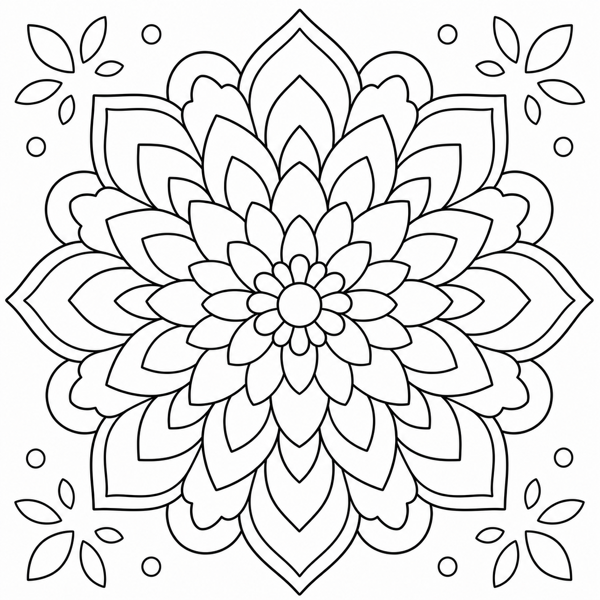
- •Mandala: perfectly symmetrical, radiating from center. Best for stress relief and adult coloring.
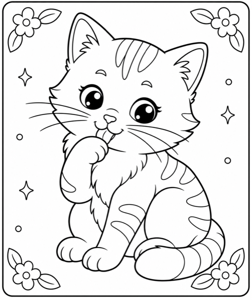
- •Bordered: subject surrounded by a decorative frame. Elegant, gift-worthy.
- •Full page: edge-to-edge pattern. Best for wallpaper, fabric, and all-over designs.
4. Style (the artistic genre)
Style is the aesthetic personality of the line work. The same subject transforms completely across styles. This is the most fun control — and the one that most changes whether a page feels "for kids" or "for adults" independent of detail.
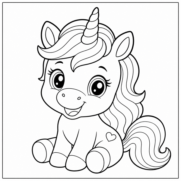
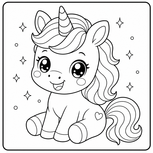
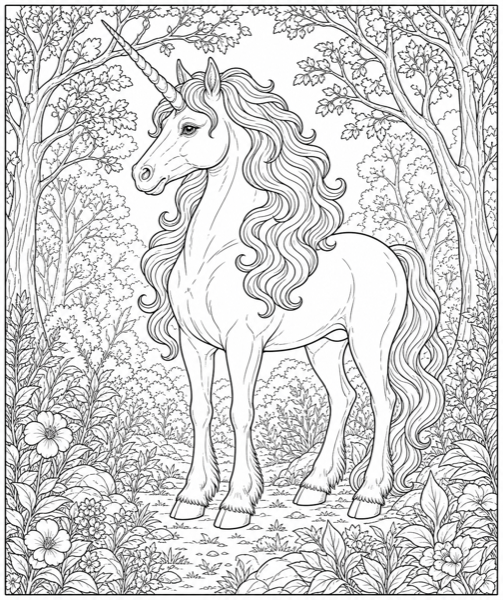
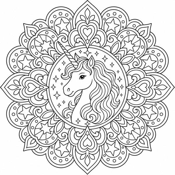
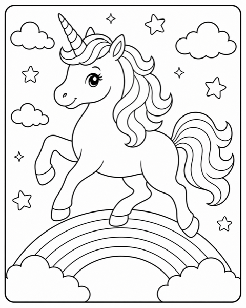
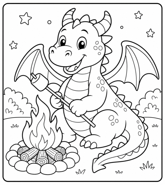
Above is the same subject — a unicorn — generated with four different combinations of the style and composition controls. Notice how the audience and style settings change the page far more than the subject itself. This is why mastering the four controls matters more than finding the "perfect" subject.
The Iteration Workflow
Your first generation is a draft, not a finished page. The people who get great results treat generation as a loop: generate, evaluate against a checklist, adjust one variable, regenerate. Here is the loop we use.
Step 1: Write a specific prompt
"A unicorn" gives the model too much freedom. "A baby unicorn with a rainbow mane standing in a flower garden" constrains it toward something specific. The formula is: subject + setting or action + style. See our prompts guide for detailed formulas.
Step 2: Evaluate against the quality checklist
Before accepting any page, run it through this checklist. Most AI coloring pages fail on two or three of these.
- •Two-tone only: no gray, no shading, no gradients anywhere. Pure black on pure white.
- •Closed regions: trace the major shapes with your finger — do the outlines fully enclose each region? Any open endpoint is a leak.
- •Consistent line weight: lines should be uniform thickness, not tapered or scratchy.
- •Right detail for the audience: count the regions. A toddler page should have under ~10 large ones. An adult page can have 50+.
- •Balanced composition: the subject should fill the frame without feeling cramped or lost.
- •No artifacts: no stray marks, duplicated limbs, or nonsense details the model invented.
Step 3: Adjust one variable and regenerate
If the page fails the checklist, change exactly one thing — not everything. Too much gray? Strengthen the two-tone constraint. Lines too thin? Move line weight up one step. Too busy for a kid? Drop the audience one level. Changing one variable at a time is how you learn what each control actually does, and it converges on a good page in 2-4 attempts instead of 10.
Tip: Keep a note of which setting combinations work for which subjects. After a dozen pages you will have your own personal recipe book — and that knowledge is the real asset.
Printing Your Pages
A great page can still disappoint if it prints poorly. Three things matter:
- •Resolution: export at 300 DPI or higher so lines stay crisp. Low-resolution exports print blurry or pixelated, especially thin lines.
- •Paper weight: standard 20 lb paper is fine for crayons and colored pencils. For markers (especially alcohol markers), use 65 lb cardstock or marker paper and put a scrap sheet underneath — markers bleed through thin paper.
- •Size: standard US Letter (8.5x11) or A4 works for almost everything. If you are assembling a book, match your page size to your trim size from the start to avoid reformatting.
Common Mistakes, Specifically
- •Asking for a "coloring page" with no constraints and accepting the shaded result. The model will add shading unless you forbid it.
- •Using adult detail for kids. This is the #1 usability failure. A detailed dragon is a joy for an adult and a frustration for a five-year-old.
- •Ignoring line weight. Thin lines + crayons + small hands = a bad afternoon. Match line weight to the coloring tool and age.
- •Changing everything between attempts. You learn nothing and converge slowly. One variable at a time.
- •Skipping the closed-lines check. Open lines are invisible at a glance but ruin the coloring experience. Always check.
Put the workflow into practice: open InkPage, pick a Quick Start recipe (the settings are already balanced), then open Customize Settings and change one control to see what it does.
Open the Free Generator →Where to Go Next
Once you can reliably produce a good single page, the next steps are scaling up. Our prompts guide gives you copy-paste formulas for every subject and audience. If your goal is a published product, the KDP guide walks through turning a stack of pages into a real paperback book. And if you plan to sell, read the rights guide first so you build on solid ground.